
Dulux 2026 Colour Forecast: getting an insider’s insights for your doors
We sit down with Dulux Colour and Communications Manager, Andrea Lucena-Orr, to get an insider's look at the 2026 forecast.
Each year, design professionals, homeowners and builders alike look to the Dulux Colour Forecast for inspiration on how colour can transform the spaces we live in. The newly released 2026 forecast offers three distinct palettes – Elemental, Evoke, and Ethereal – each reflecting emerging cultural moods and aesthetic directions. For Corinthian Doors, the forecast provides a unique resource for exploring how entrance and interior doors can be powerful unifiers in a home and help our customers apply colour to their doors to echo broader design trends.
We sat down with Dulux Colour and Communications Manager, Andrea Lucena-Orr to understand what went into the development of this year’s forecast.
Three palettes to create tenderness and connection through colour
Since its inception in 1999 and under Andrea’s stewardship, the Dulux Colour Forecast has grown into a beloved institution relied upon and referenced by professionals and design-lovers here and abroad. Dulux specifically includes three palettes each year in its forecast.
“Colour is such a personal thing,” Andrea tells us. “We don’t do a single ‘colour of the year’ because we want people to find themselves in the forecast. Each palette offers different pairings and options, so you can be individual in how you use them.”
This year’s forecast reflects a desire for connection and a softer sense of tenderness that is reflected across three distinct palettes.
Elemental
Andrea describes Elemental as “a reflection of thoughtful consumption and balanced living. It’s not about having less for the sake of it but about making room for what truly matters.”
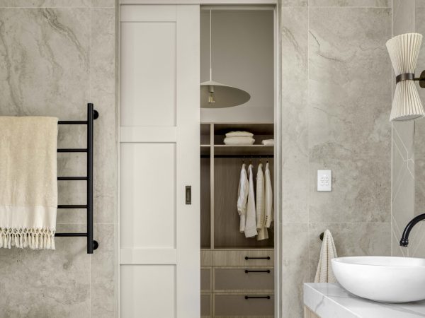
These effortless, accessible tones work beautifully on doors where understatement and calm are the goal.

Evoke
Evoke embraces richness and nostalgia while helping colour create a timeless effect.
“It’s around cherishing treasures and classical styles, either brought back or reinterpreted in a modern way,” Andrea says. “It’s eclectic, warm and references past eras like Deco, postmodernism, and even the retro-futurism of the 60s and 70s.”
Selecting a single hue from Evoke across interior doors can help ground your home’s aesthetic amongst a more eclectic design approach.
Ethereal
Finally, Ethereal offers softness and optimism.
“It’s the whimsical palette, inspired by nature and designed for emotional restoration,” Andrea explains. “It features soft, curved lines with no sharpness, and fabrics like velvets and suedes. It’s about embracing a more hopeful outlook.”

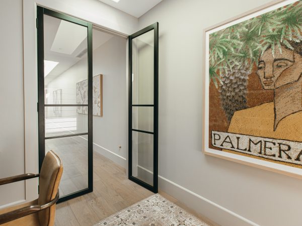
Using your doors as a canvas for experimentation
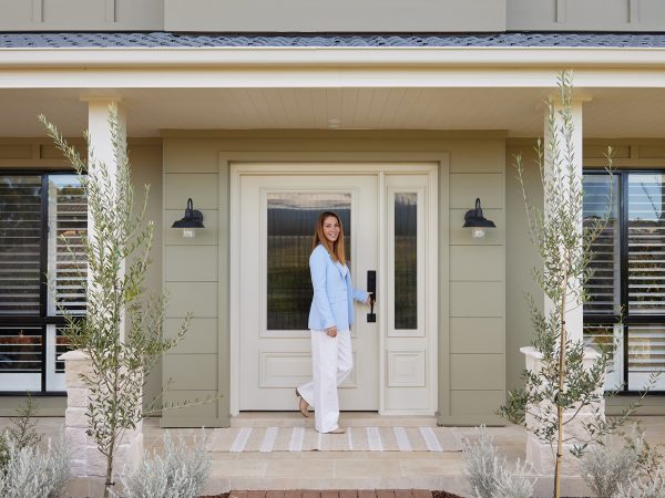
Andrea sees doors as the perfect place to experiment with colour.
“An entrance door allows you to bring your own personality to the front of the home. I can recall one stylist who repainted her front door for every season. It was quick, easy, and I thought it an easy transformation that reflects the seasons and individualises a home.”
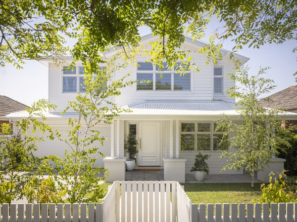
One tip Andrea has for use of colour in your doors? Understand the surrounding lighting environment and how colour interacts with it across different door textures and when open and closed.
“Exterior colours always look lighter because there’s so much more natural light outside. You might go full strength on an entrance door, but only need quarter strength inside to create something that looks relatively similar.”
And when it comes to exterior doors, it’s important to always understand the role of the light reflective value (LRV). An LRV of over 50 is necessary to protect your exterior door from the harsh impacts of the sun’s rays, which is why lighter-coloured doors can come to play.
“With its light, soft and subtle colours, the whimsical Ethereal palette would be perfect with this in mind,” Andrea notes.
Why colour matters across your home
For Andrea, colour is never just surface-level. It’s impact on the experience of a space is multi-faceted and powerful, which is why it’s important to test and play with colour.
“From a psychological perspective, colour makes a massive difference. Soft pinks are nurturing, greens are restorative, blues are tranquil. Each hue creates a different mood. That’s why it is so important to test colours, especially for doors. Especially for the front of home, your street appeal and something you come home to every day.”

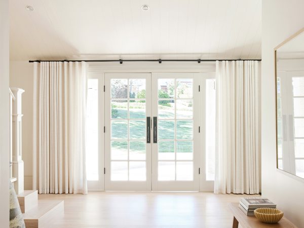
And when it comes to harmonising door colour with interior palettes, both colour and light interact to have powerful impacts on your design and experience of a space.
“Lighting design plays a massive role. Most internal doors are in hallways, which often have the least light in the whole home. Sometimes just adding colour there gives interest, otherwise it can all look a bit same-same,” says Andrea.

“You can also play with slight changes in colour or tone; for instance, harmonising like an ombré effect. It doesn’t have to be dramatic, like blue to red. Or you could use one colour, but gradually get lighter as you move through the house or as the light changes.”
Feeling inspired?
Explore the full Dulux Colour Forecast 2026 to discover a palette combination that suits you and then discover our full range to start thinking about how to apply it to your entrances and interior doors.
Found something you love? Don’t forget to save your favourites to My Doors!
Keep reading

Prior winners of The Block, Steph and Gian, walk us through their delightful period-home restoration at Japandi Estate.
Read more
We've moved our full RRP pricing online. Our website is now your price list.
Read more
Edgecliff Homes has achieved something remarkable at Morley 2.0: a reimagining of Modern Farmhouse at-scale.
Read more